EXAMPLE DATASET: TELCO CUSTOMER CHURN DATASET
To demonstrate the h2oml suite, we focus on a GBM for binary classification. Other models such as random forest or GBM for regression have similar syntax and workflow. We’ll analyze data from a fictional telecommunications company called Telco, which offers home phone and internet services in California. The dataset, provided by IBM, contains information on 7,043 customers with 26 variables. Our main objective is to develop a predictive model that can identify which customers are at risk of churning—meaning they might terminate their services with Telco. Our binary response, churn, indicates whether a customer discontinued service in the past month or remained with Telco.
The predictors (features) include customer demographics (such as gender and age); account details (such as contract type and tenure length); and service subscriptions (such as internet, phone, and security service).
We want to predict customer behavior patterns that signal potential churn, which could help Telco take proactive steps to retain valuable customers.
PREPARE YOUR DATA FOR H2O MACHINE LEARNING IN STATA
We first load our dataset and initiate an H2O cluster.
![]()
We then put the current dataset into an H2O frame, churn, and make it the current H2O frame.
![]()
We split our current frame into training and testing frames with 80% of observations in the training frame. Later on, we will use CV on the training frame during estimation to control for overfitting.
![]()
For convenience, we create a global macro, predictors, to store the names of predictors.
![]()
REFERENCE GBM MODEL
We fit a GBM model with 3-fold stratified CV (SCV) using default values for other settings and h2orseed(19) for reproducibility. SCV is particularly useful for classification tasks with imbalanced classes (levels of churn).
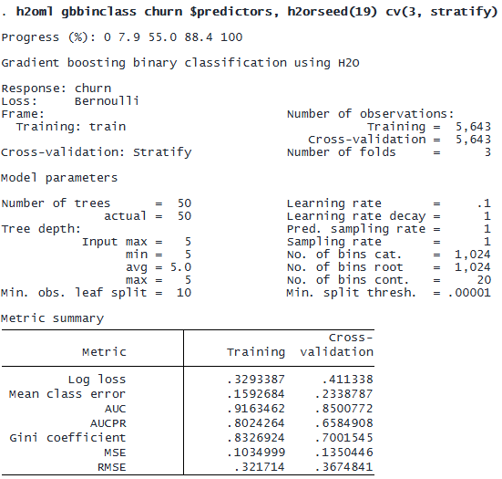
The header provides model details, showing that h2oml gbbinclass uses Bernoulli loss (other loss functions are available for regression with h2oml gbregress). The training frame contains 5,643 observations, and we use 3-fold SCV on it. The hyperparameters section (Model parameters) reports both user-specified and actual values used by the algorithm for hyperparameters, which may differ if early stopping is specified.
The metric summary table presents binary classification performance metrics for the training and CV data. We will rely on the area under the precision–recall curve (AUCPR) as the metric of choice because we have imbalanced classes. AUCPR ranges from 0 to 1, with 1 meaning perfect performance. Although CV metrics are our main focus, we also check training metrics to ensure slight overfitting and to avoid underfitting of the model. A positive difference between training AUCPR and CV AUCPR (0.8024 − 0.6585 = 0.1439) is expected, but a large gap may suggest overfitting, meaning the model may not generalize well to new data.
We store the reference estimation results for later comparison:
![]()
Assessing metric variability across the three folds ensures model performance is not tied to a specific data split. High variation in CV metrics may indicate poor generalization to new data. This can be done by using the h2omlestat cvsummary command; see example 2 of [H2OML] h2oml and [H2OML] h2omestat cvsummary.
MODEL SELECTION AND HYPERPARAMETER TUNING
Our baseline model’s CV AUCPR was 0.6585. To improve model performance, we will tune hyperparameters. GBM has 11 tunable parameters, but we will tune only ntrees() (number of trees) and predsamprate() (predictor sampling rate) within a small search space for simplicity. Hyperparameter tuning is an iterative procedure, and this example illustrates only the tuning specification.
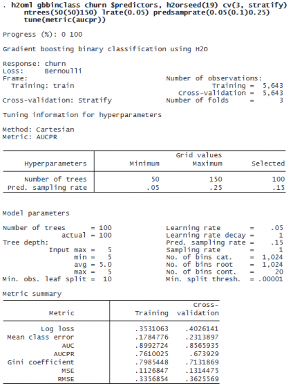
The header displays tuning details, including the tuning method (Cartesian), tuning metric (AUCPR), and grid-search ranges for hyperparameters. The selected values, 100 for ntrees() and 0.15 for predsamprate(), correspond to the best-performing model. The rest of the output presents the hyperparameter values and the metric summary for the optimal model.
By tuning, we increased the CV AUCPR from 0.6585 to 0.6739. The improvement is small because we explored only a small portion of the hyperparameter space in this example.
Let’s store this best-tuned model for later use:
![]()
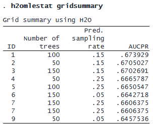
We may obtain the grid-search summary by using the h2omlestat gridsummary command. This command lists the configurations of the hyperparameters we are tuning ranked by AUCPR.
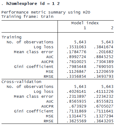
We may wish to compare the first two models based on other metrics by using the h2omlexplore command:
If we choose a model other than the best-tuned one (perhaps a model with slightly worse performance but using fewer trees), we can select it via the h2omlselect command; see [H2OML] h2omlselect.
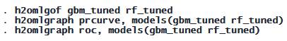
Let’s compare the best model, gbm_tuned, with the reference model from the previous section, gbm_default, based on other metrics by using the h2omlgof command.
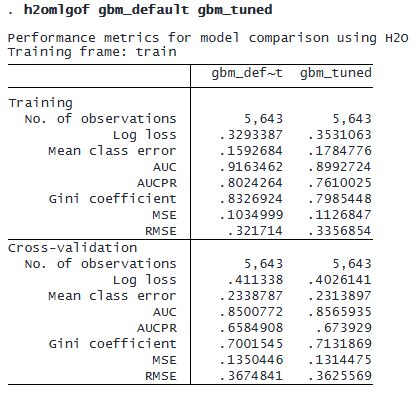
The output shows training results followed by CV results. Looking at the CV results, we see that tuning improved performance across all metrics: lower log loss, mean class error, MSE, and RMSE and higher AUC, AUCPR, and Gini coefficient. This indicates that the tuned model has better model performance.
We may also refine the list of predictors based on variable importance:
![]()

Based on the above graph, we may decide to drop the predictor onlinebackup.
METHOD SELECTION: GBM VERSUS RANDOM FOREST
Suppose we trained a random forest for binary classification using h2oml rfbinclass, following the same steps as before. For simplicity, suppose that after hyperparameter tuning, the best model is

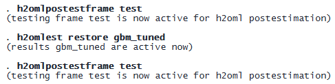
Now we compare the tuned random forest method (rf_tuned) with the tuned GBM method (gbm_tuned) using the test frame (the testing frame created during the frame split). We use the h2omlpostestframe command to specify the name of the frame, test in our case, to be used by all subsequent postestimation commands for computations for both the rf_tuned and the gbm_tuned results:
© Copyright 1996–2026 StataCorp LLC. All rights reserved.
Instead of listing the performance metrics on the test frame separately for each method using h2omlestat metrics, we use h2omlgof to show the results side by side:
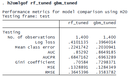
GBM outperforms random forest because it has a higher AUCPR, making it the preferred method. We can further compare the methods using ROC curves, where a curve closer to the upper-left corner indicates better performance. See [H2OML] h2omlgraph roc.
![]()

Based on the ROC results, as we expected, the GBM method slightly outperforms the random forest method.
Another popular approach to compare classification predictions between different methods and models is by using a confusion matrix, which reports the numbers of correctly and incorrectly predicted outcomes. See [H2OML] h2omlestat confmatrix and example 4 of [H2OML] h2oml.
PREDICTION ON NEW DATA
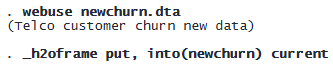
Suppose the company collected new data stored in newchurn.dta. It wants to predict the probability of churn for these new customers based on the GBM model gbm_tuned. Let’s read the new dataset as an H2O frame newchurn.
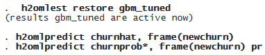
We use h2omlpredict to predict churn probabilities and classes. By default, it predicts classes (Yes or No); to get probabilities, specify the pr option. In the previous section, we set test as the postestimation frame via h2omlposttestframe. So, by default, h2omlpredict will use the test frame for predictions. To obtain predictions for the new dataset, specify frame(newchurn). Below, we predict both classes and probabilities using the GBM model gbm_tuned.
The generated variables for the classes (churnhat) and class probabilities (churnprob1 and churnprob2) are stored in the newchurn frame because we specified frame(newchurn). Let’s list the predicted classes and probabilities.
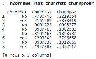
For example, churnprob2 (abbreviated to churnp~2) shows a 22% chance of churn for the first customer and 78% for the second. The predicted class (Yes or No) in churnhat is assigned based on whether churnprob2 exceeds the default F1-optimal threshold of 0.2378. This value is obtained using h2omlestat threshmetric, which displays thresholds that optimize various metrics. To use a custom threshold, specify it with the threshold() option in h2omlpredict.
EXPLAINING PREDICTIONS
One of the key challenges in machine learning is understanding why a model makes specific predictions. Explainability ensures that predictions are not only accurate but also interpretable and justifiable.
Global models describe the average behavior of a machine learning model. Examples include the following:
- Variable importance
- Global surrogate models (simple interpretable models approximating machine learning predictions)
- PDPs
Local models explain individual predictions by approximating the model’s behavior for a single observation. Examples include the following:
- ICE curves
- SHAP values
GLOBAL EXPLAINABILITY MEHODS
We have already seen an example of a variable importance graph; therefore, we focus on building a surrogate model here. We start by restoring the best GBM model (gbm_tuned) trained earlier.
![]()
Next we use the GBM model to predict churn for the entire frame, rather than just the testing frame, by specifying the frame(churn) option:
![]()
To improve explainability, we build a global surrogate model using, for example, a classification tree to approximate the predictions churnhat from model gbm_tuned.
First, we switch the working frame to the full churn frame:
![]()
Then, for illustration, we use a single decision tree (ntrees(1)) with maximum depth of 3 (maxdepth(3)) as a global surrogate model:
![]()
This classification tree serves as a simplified approximation of the complex GBM model, making the predictions more interpretable while retaining useful insights.
A classification tree is easier to interpret visually. Using the dotsaving() option of the h2omltree command, we can generate a DOT file that can be plotted using Graphviz for better visualization; see https://graphviz.org, [H2OML] DOT extension, and [H2OML] h2omltree.
![]()
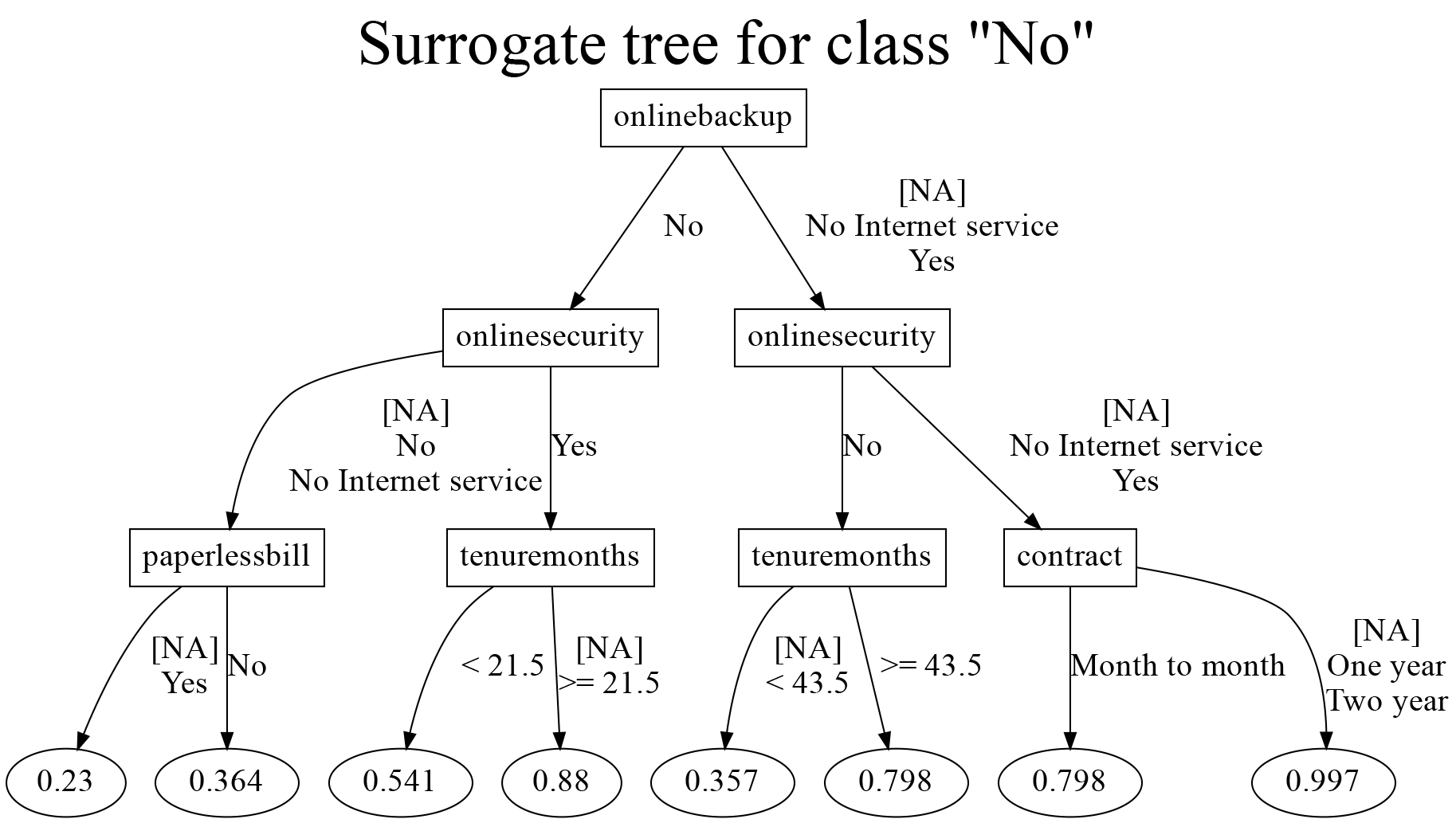
The terminal node values represent the probability of a customer not churning (No). For example, customers with one- or two-year contracts who either have no internet service or use online backup and security have the highest probability (0.997) of staying with the company. This means their churn probability is only 0.003 (1 − 0.997), making them the least likely to leave.
Next we analyze how important predictors (identified by h2omlgraph varimp earlier) influence churn. We use PDPs, a global explainability method that shows the marginal effect of selected predictors on predictions. We first restore the GBM model’s estimation results to ensure that subsequent postestimation commands apply to the best GBM model (gbm_tuned).
![]()
We use h2omlpostestframe with the notest option to set the churn frame as the active frame for postestimation analysis without treating it as a testing frame.
![]()
We then generate PDPs for key predictors:
![]()

The PDP pattern (red line in the plot) agrees with the results from the surrogate tree. For instance, the probability of churning (shown on the y axis) decreases for customers with a one- or two-year contract (contract) and for customers who use the company’s services longer (tenuremonths); see [H2OML] h2omgraph pdp.
LOCAL EXPLAINABILITY METHODS
For local explainability, we use SHAP values, which estimate each predictor’s contribution to an individual prediction. SHAP values help explain why specific customers are predicted to churn, making machine learning decisions more transparent.
We now use h2omlgraph shapvalues to produce SHAP values for observation 19 (female customer who used a month-to-month contract service for 9 months and has both the observed churn and predicted churnhat values of Yes) for the top 10 SHAP important predictors.
![]()

Blue bars indicate predictors that increase churn probability, whereas red bars indicate those that reduce it. The SHAP values agree with the previous findings. Particularly, a month-to-month contract, small tenuremonths, and not using online security services contribute positively to this particular customers’ churning. Note that SHAP values for binary classification are reported on the logit scale. For instance, raw prediction f(x) = 0.2063 is logit of the predicted probability that “observation 19 will churn”. You must use the inverse logit transformation to interpret them as probabilities; see [H2OML] h2omlgraph shapvalues.
The SHAP summary (beeswarm) plot visualizes SHAP values across all observations, showing both predictor importance and influence on the response. For illustration, we plot the top 4 most important predictors:
![]()

Predictors on the y axis are ranked by SHAP importance (largest absolute SHAP values first). Smaller normalized predictor values of contract (month to month versus one year versus two years), shown in blue, are associated with positive SHAP values, meaning that shorter contracts make customers more likely to leave (increase the probability of churning); see [H2OML] h2omlgraph shapsummary.
SHUTTING DOWN THE H2O CLUSTER
After you are done with your analysis, disconnect from the H2O cluster by using
![]()
This closes the Stata-H2O session but keeps the cluster running in the background. You can reconnect later with
![]()
To fully shut down the cluster and delete all resources, use
![]()