HEAT MAP
A heat map displays values of z across values of y and x as a grid of colored rectangles. The observations are binned by y and x grids. Below, we create a heat map displaying monthly average temperatures for College Station, Texas, from 2000 to 2024:
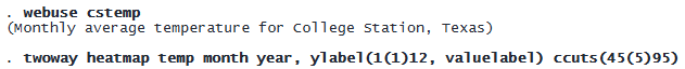
Each rectangle represents a month in a year, and we fill in each rectangle with a color based on the temperature. We specified the cutpoints for the levels of temperature, from 45 to 95, in increments of 5; this gives us differently colored rectangles for different temperature levels.
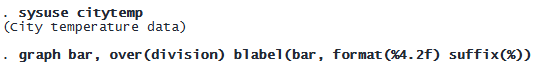
BAR GRAPH
Add prefixes and suffixes to bar labels
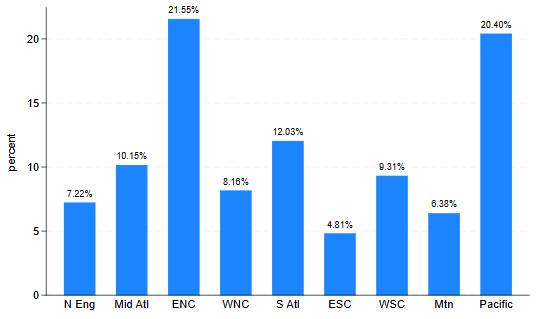
We can easily add prefixes and suffixes to the bar labels. For example, we could suffix the bar labels with a percent sign:
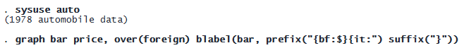
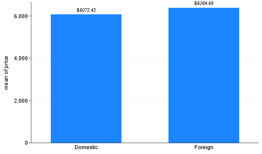
Or we could prefix the bar labels with a bold “$” sign and make the labels italic:
© Copyright 1996–2026 StataCorp LLC. All rights reserved.
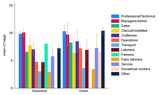
MEANS AND CONFIDENCE INTERVALS
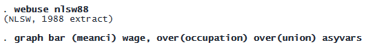
We may specify meanci to display the mean value with a confidence interval line. For example, we plot the average wage for different occupations, and the corresponding confidence interval:
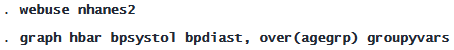
GROUP BARS BY Y VARIABLES
We may specify the groupyvars option to group bars belonging to the same y variables instead of grouping bars based on categories of the over() variable. For example, below we plot the mean systolic and diastolic blood pressure for individuals in different age groups:
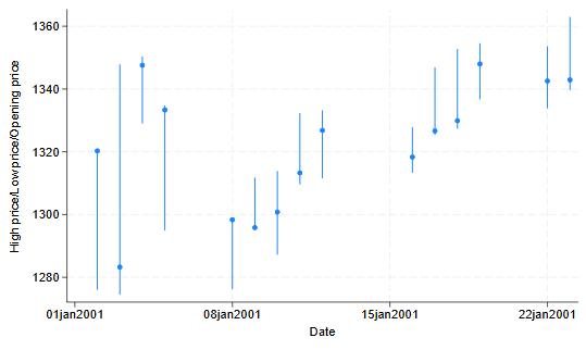
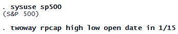
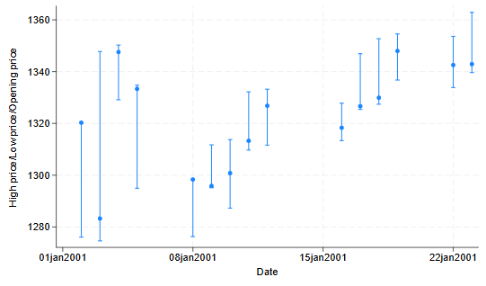
RANGE AND POINT PLOTS
We can easily plot a value and range with plottypes rpcap and rpspike. For example, we want to display the range of high and low stock prices along with the daily opening price. To connect the high and low values, rpcap uses a capped spike and rpspike uses a spike. Both use a marker for the opening value.
![]()